Vidyo Connect Room System
Company:
Vidyo
Role:
UX Lead
Collaborated with:
UX Designer
Product Manager
CX Manager
Tech Lead
QA Lead
Skills:
Design thinking
UX / UI
Vidyo’s Conference Room System
Context
Vidyo Connect is a robust video conferencing solution that can be accessed from high-performance room systems to personal laptops or smartphones.

The problem
The original video conferencing solution was designed and implemented as an MVP and needed to be updated to keep up with users' pain points and needs. Vidyo Connect was one of the first enterprise-level video conferencing solutions, but newcomers and competitors quickly caught up, and updating the experience became critical to the business.
The goal
Increase customer reach and retention by providing a cohesive omnichannel experience.
The solution
Smoothen the holistic experience across platforms with a cohesive and optimized design across all touchpoints. The re-designed applications needed to be as consistent as possible, from the room system to the mobile app. It also needed to cater to users who didn't have the app downloaded and needed to access the cloud-based experience from their browser.
Scope and constraints
- Leverage device strengths to improve the experience across channels.
- Re-designed experiences needed to work with existing hardware, specifically room systems.
Design thinking tools:
Collaborating with the team
The Product Manager: I collaborated closely with the Product Manager to understand context, the overall product vision, business goals and how the app was expected to fit into those goals.
The Senior UX Designer: I collaborated with the Senior UX Designer to define how the user will interact with the product overtime by honing into touchpoints, use cases, map out flows, design screens and build prototypes to share and test. The Customer Experience Manager: I did a deeper dive on user attitude by reviewing customer feedback and learning what I didn’t know. identify patterns in their pain points and synthesize feedback into key takeaways to include in product ideation. The Developers and QA Engineers: I had regular syncs to understand tech constraints and what would make it more feasible to launch the app in a timely manner without compromising value.

Process Overview
1. Research
1.1 User interviews: prepared discussion guides and conducted usability tests with the original system to identify pain points and opportunities for improvement.
1.2 Competitive analysis: conducted a SWOT analysis to understand the strenghts, weakenesses, opportunities and threats of other video conference systems and how they compared with Vidyo Connect.
1.3 Tech research: collaborated closely with the Tech Lead to understand the existing system, its strengths, weaknesses and constraints from hardware installation to the user interface.
1.4 Customer feedback: worked with the Customer Success Manager to identify patterns in the user feedback and compare them with findings from our user interviews, this provided a good overview of users’ pain points and feature requests.
2. Synthesis
2.1. Personas and journey maps: As part of the research synthesis we created personas and journey maps to help align the different teams which were collaborating on the project, and to be used as artefacts during the ideation process. Personas were used to share relevant characteristics of our target users, and journey maps helped tell the story of how these users interact with the system over a certain time period. The journey maps clearly depicts where the system is helping the user and the pain points that should be addressed with the new product design.

Personal Devices

From our user research we defined three core personas with distinct use cases that we used to help guide the design solution.
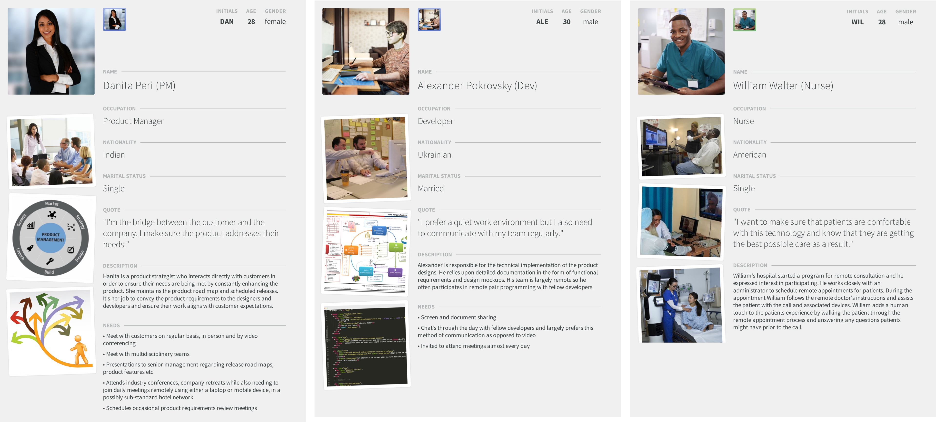
Journey maps were created to visualize pain points of each persona across different channels. This provided a good shared understanding of what parts of the journey we needed to focus on.

3. Ideation
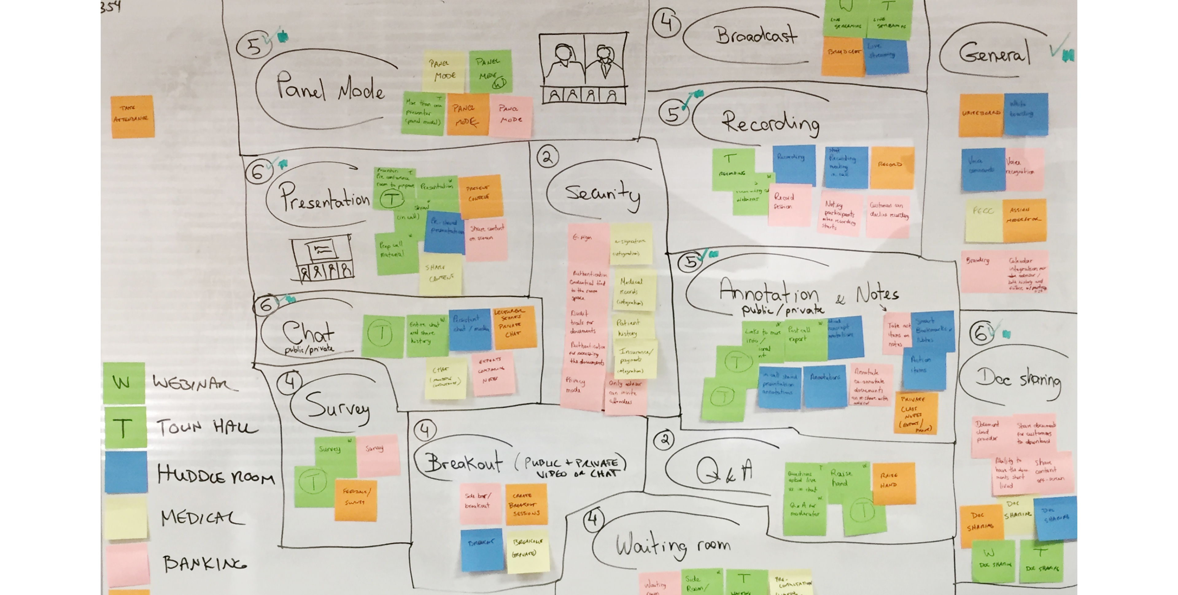
3.1 Ideation sessions: I led ideation sessions with stakeholder cohorts to generate ideas for features that would align with the goal and address the pain points uncovered during the research phase. Ideas were then grouped into themes and prioritized by level of design and development effort as well as user value.
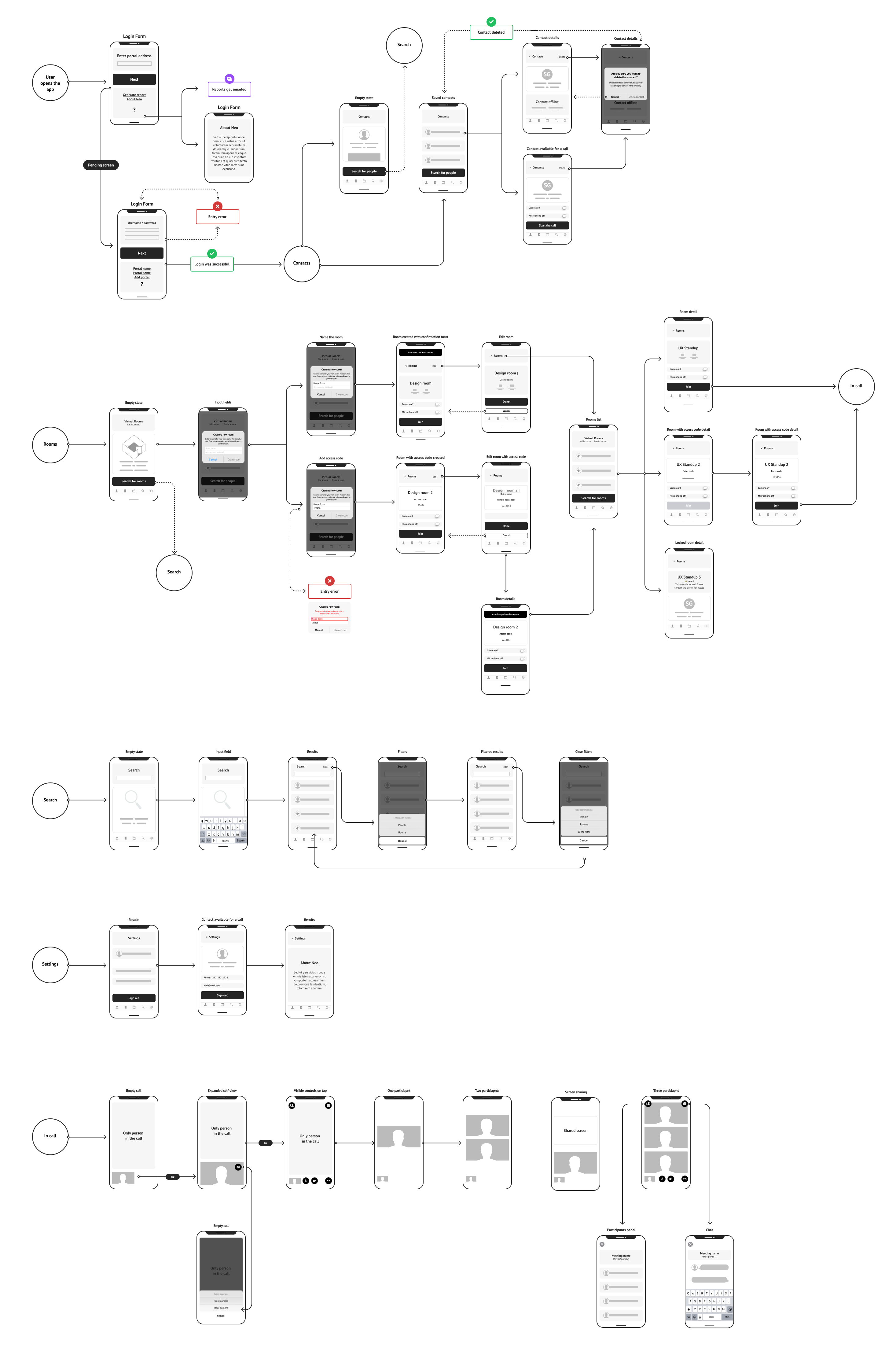
3.2 Sketching and wireframes: after the ideation sessions I collaborated with the Product Manager and Tech Lead to do a deeper dive on the prioritized ideas and then moved on to sketching and wireframing screens and flows to start bringing our vision to life.
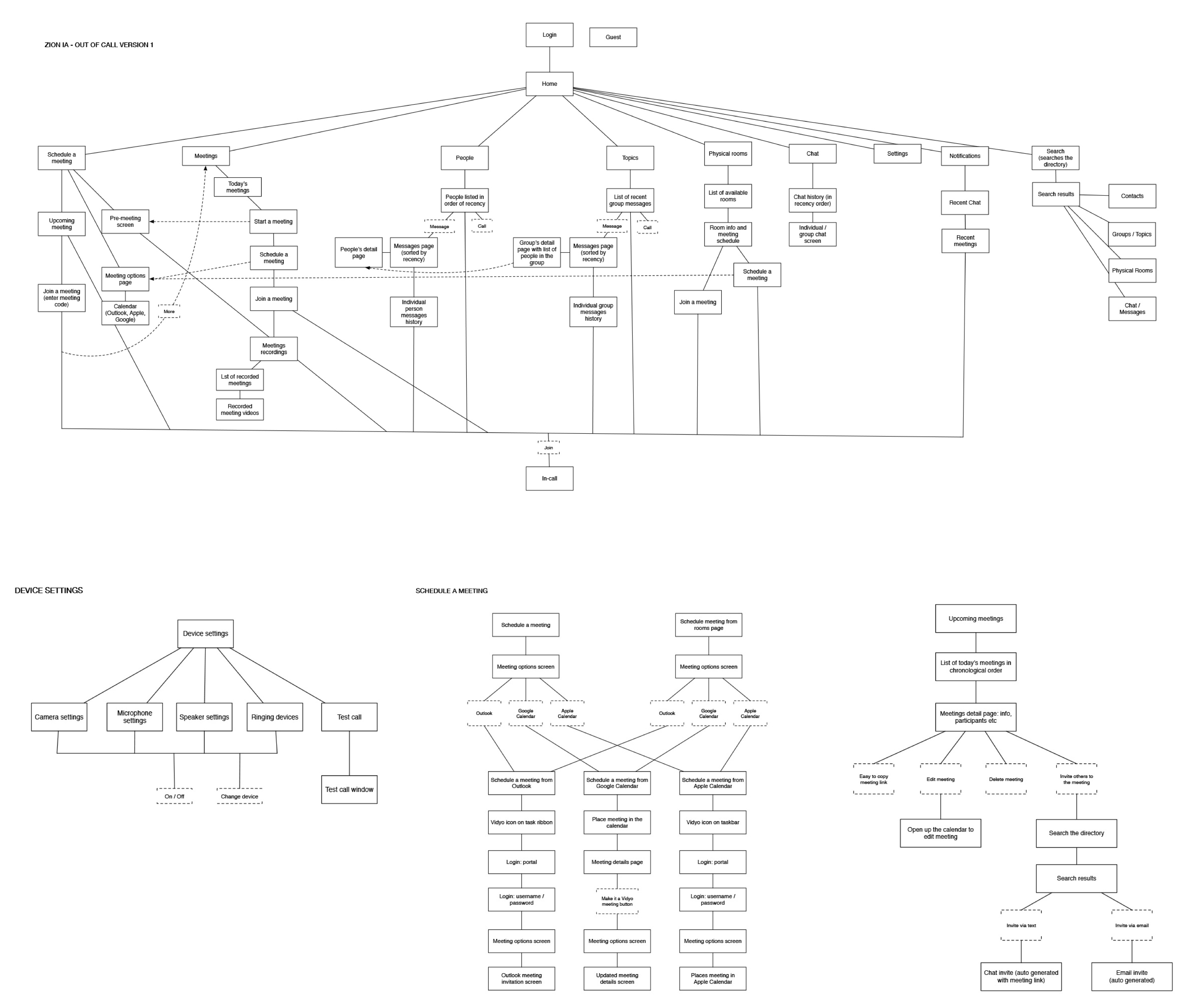
3.3 IA: since there were many parts to the system I worked on intital flowcharts to make sure there was a shared understanding of the complexity and dependencies between the different system channels and devices.
Ideation sessions were held with stakeholders to generate ideas for features that would align with the pain points uncovered during the research phase. All ideas were sorted into an affinity map and prioritized based on user value and estimated level of effort.
Selected ideas were translated into wireframes and used for user testing. The wireframes samples below were created for users signing into their individual accounts.


Breaking down the user flows for the different parts of the system helped visualize dependencies and overall complexity of the system as a whole.
4. Prototyping
Once there was alignment amongst stakeholders on the proposed wireframes, I moved onto higher fidelity designs and prototyping. Designs accounted for different states of each part of the system. Prototypes gradually moved up in fidelity and were aimed at testing the highest risk features of the system as a whole.
5. Testing
In preparation for our usability test I created a discussion guide outlining tasks that the user should be able to easily complete. Once the test tasks were defined I collaborated with engineers to create a functional prototype that was used in our test sessions. The prototype included the core functionality and states based on our vision for the final product.
Key feedback, insights and proposed iterations were documented in a UX report which was shared with stakeholders after each round of tests was completed.

Insights from the usability tests were documented in a UX report and shared with stakeholders to help guide iterations and next steps.
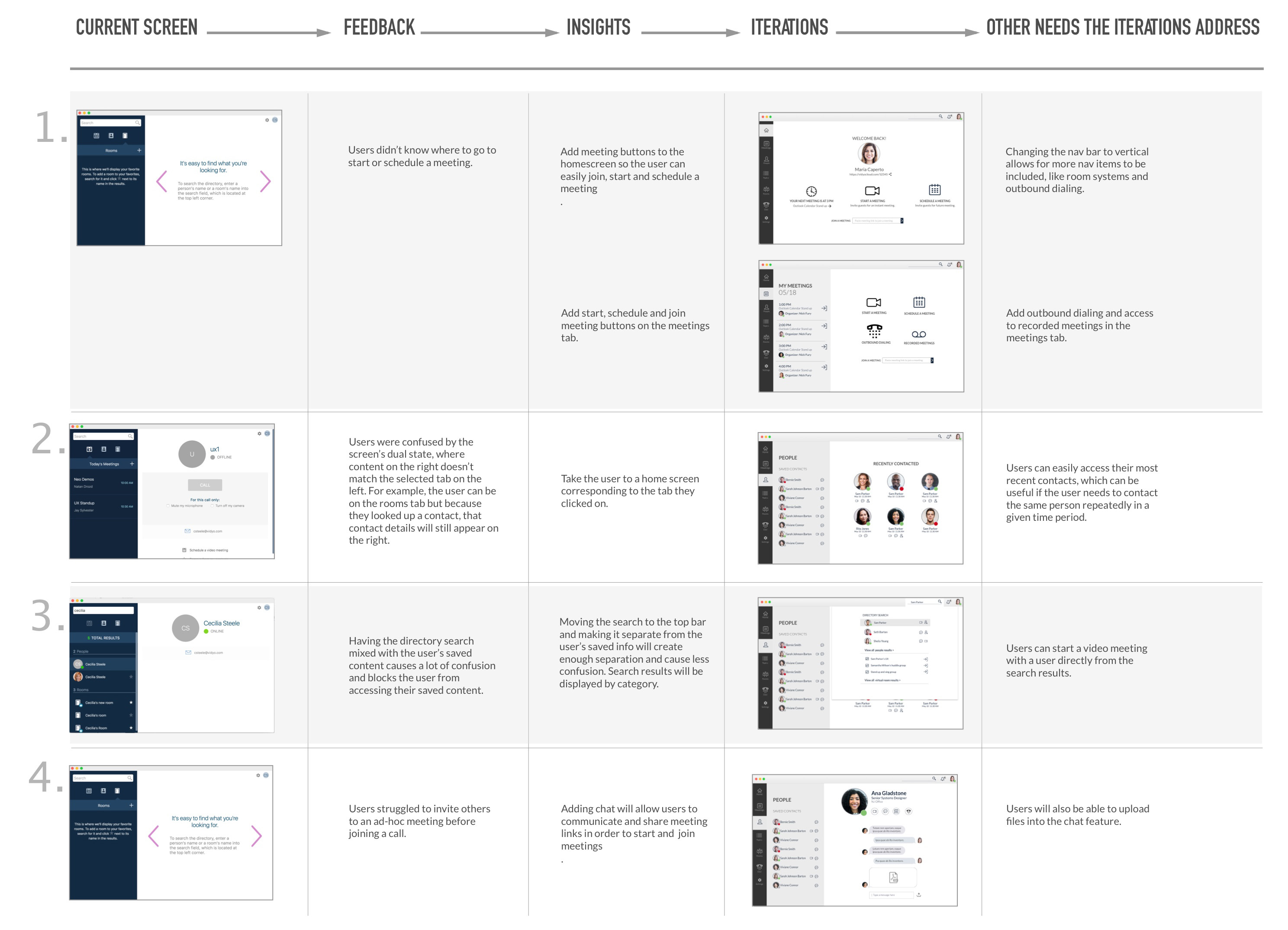
The level of prototype fidelity increased as iterations were made to the designs and new tests were conducted.


Room Systems
The room system interface was designed to be consistent with the personal client, in order to facilitate learnability and transitions between devices.


Seperate flow charts were created to hone in to different tasks supported by the system.


Remote Control
Room systems require a remote control which we learned from our research, is often misplaced. To ease that pain point we designed a remote app that can be paired with any room system within reach.

